Backstory and Requirements
Prior to our involvement, user testing had not been done on the Denver Post Website. Since this was a new initiative, we wanted to establish a baseline regarding the site's user experience. To do so, we conducted a series of usability tests. The goal was to gather overall opinions of the site design as well as test whether or not users could complete key tasks set forth by the editorial, sales, and development legs of the company.
Test Process
A total of 25 test sessions were conducted. Each session was recorded and streamed online via web conferencing to include team members outside of the Denver Office. Testing focused on task analysis and user interviews, in order to determine pain points in navigation, along with users' impressions of site layout and content.
To increase stakeholder participation in the test process, we used an iterative process when deciding tasks to test. After each round of testing, we would review the data received and work with stakeholders to determine areas that required more testing. Sample tasks included asking users to post a classified ad, find an article specific to the area they live in, and walk us through their daily routine on the site (for existing users).
Observations and Outcomes
A number of useful observations were produced through testing, here are two of the key findings and the benefits they provided the company:
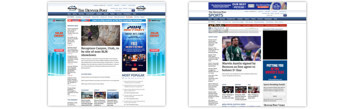
Ineffective Ad Placements
Participants commented that the advertising was having a negative effect on their experience with the site. Most of them commented that they understand the necessity for ads, but that the site had breached their tolerance level. We utilized footage of these tests to bridge the gap between the editorial and sales departments and have them work together to find a solution. A full audit of all ads on the site was conducted and it was discovered that in one month, the company had spent over $400k on remnant ad placements that used site space, but did not generate revenue. The company is working to remove these ad places, which will reduce page clutter and generate a savings of almost $5 million dollars over the next year.
Unpopular Site Content
We asked participants to identify elements on our pages that caught their attention or seemed interesting. After a series of tests we noticed that there were certain elements that received very little attention from users. We presented our recommendations to stakeholders, who conducted a review of the elements in question. After looking at the traffic metrics, they determined that our findings were correct and removed some of the elements. One of the widgets removed was costing the company approximately $500,000 per year. By eliminating this widget the company was able to save this revenue and help reduce page clutter, resulting in a better user experience.